
36 Days of Type – My type of project
SHARE
Isaac Coppin
04 May 2022
Typography has always been an important medium in the foundations of graphic design. For as long as I can remember, I’ve been interested in how letters from renowned and contemporary typefaces can be used as part of individual design pieces, and the range of emotions they can convey when done right.
Held once a year, 36 Days of Type is a digital design-based challenge that pushes typographers, designers, illustrators, and artists of all backgrounds to express their design prowess and unique style. By reimagining the 26 letters of the English alphabet and all 10 digits, the challenge aims to explore the open boundaries of letterforms and their endless graphic possibilities, all while maintaining a daily posting cadence.
I first learned about 36 Days of Type back in 2019, discovering it through my design Instagram account. I’ve participated in it every year since and I find it an interesting side project away from my day-to-day design work.
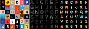
Previous versions I have done, Procreate, Kinetic, and Around the World.
Previously, I’ve explored and experimented with different themes and possibilities for each letter and number and used my illustration skills to my advantage. However, I chose to do something less illustrative and more graphical this time.
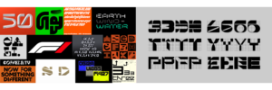
Moodboard and unused letter & number concepts following a grid structure.
My process was straightforward. I would usually start by sketching a series of hand-drawn letterforms that I then digitalized and tweaked until I was happy. I mainly built each individual letter and number on a foundation of craft, working from the juxtaposition between different shapes and aspects such as thick and thin, curved and square, organic and industrial, serif and sans, etc. I attempted to create forms that struck a solid balance between these qualities, making them more akin to standalone design pieces than actual typography.
As this was a side project, it was sometimes a challenge to execute ideas to perfection while balancing my other work. The first few were the hardest as they grounded how the following letters and numbers would go from there aesthetically. When working on the earlier letterforms, I often found myself with an idea for one further down the line. But once I got the concept out of my head and onto paper, it made things easier knowing that some of that uncertainty had been lifted so I could keep things consistent throughout.
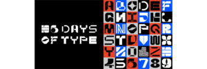
My final set for 36 Days of Type 09.
What I like about the challenge is how accessible it’s become to all kinds of creatives, not just the designers. I recall seeing one last year where someone made the letters out of driftwood found on the beach, so there truly is room to express yourself – whatever form that takes!
Keep an eye out for next year’s submission!
Check out my work at @isaaccoppindesign
Main Inspirations:
Sawdust Studio https://www.instagram.com/sawduststudio/?hl=en
The Designers Republic https://www.thedesignersrepublic.com/
Benoît Bodhuin https://www.bb-bureau.fr/